commercial project
Role:
UX Designer
UI Designer
Low-code Developer
Scope:
Market Research
UX Design
Prototyping
UX Audit
UI Design
Usability Testing
Team:
Me (designer + low-code developer)
Blue-Mint Agency (developer)
Duration:
6 months
Problem:
The outdated website was misaligned with the company’s growth and failed to reflect its ambitions of expanding global recognition. With the ordering system relying solely on phone and email, it created significant friction and hindered the sales funnel.
Solution:
The modern website should function as both an intuitive platform for product inquiries and a trusted industry resource. By offering a rich library of technical knowledge for lighting engineers, it should foster engagement and highlights the company’s expertise.
Result:
The new website with rich features set like product configurator, inquiries form and designer's zone has been launched.
The company was founded in 2011 and started from level zero. First couple of years, it devotes its resources, working on low margins, to build its own know-how and market position. They produce different types of industrial lighting, but there is one special products family - explosion-proof lighting. These light fixtures are dedicated to refineries, offshore platforms, distilleries - everywhere where the explosion hazardous atmosphere may occur. Thanks to efficient R&D Department, the company obtains the required ATEX certification for such applications. Orders are starting to arrive from all over the world, with most of them coming from Europe and the Middle East.
After covid, the company is experiencing a boom in orders. Suspended projects are being unblocked and the company is producing more and more lighting, sending it to all continents. In 2022 the new headquarters with brand new production plant is being opened. At this stage, the outdated website is not matching company anymore.
▪️the products are not as cheap as Chinese substitutes,
▪️the brand is not well known in the world,
▪️old website does not inspire customer confidence.
▪️no CTA on the product sites which is a great marker for the sales funnel performance on the late stage,
▪️contact available only on 'contact' page, which forces the product page being closed,
▪️relatively high amount of users (75k in 2023) mainly from organic search,
▪️only 5,3% of recurring visitors indicating poor website retention,
▪️the site does not support conversion sufficiently,
▪️bad average session duration - only 38 sec.
▪️the website has an old-fashion layout.
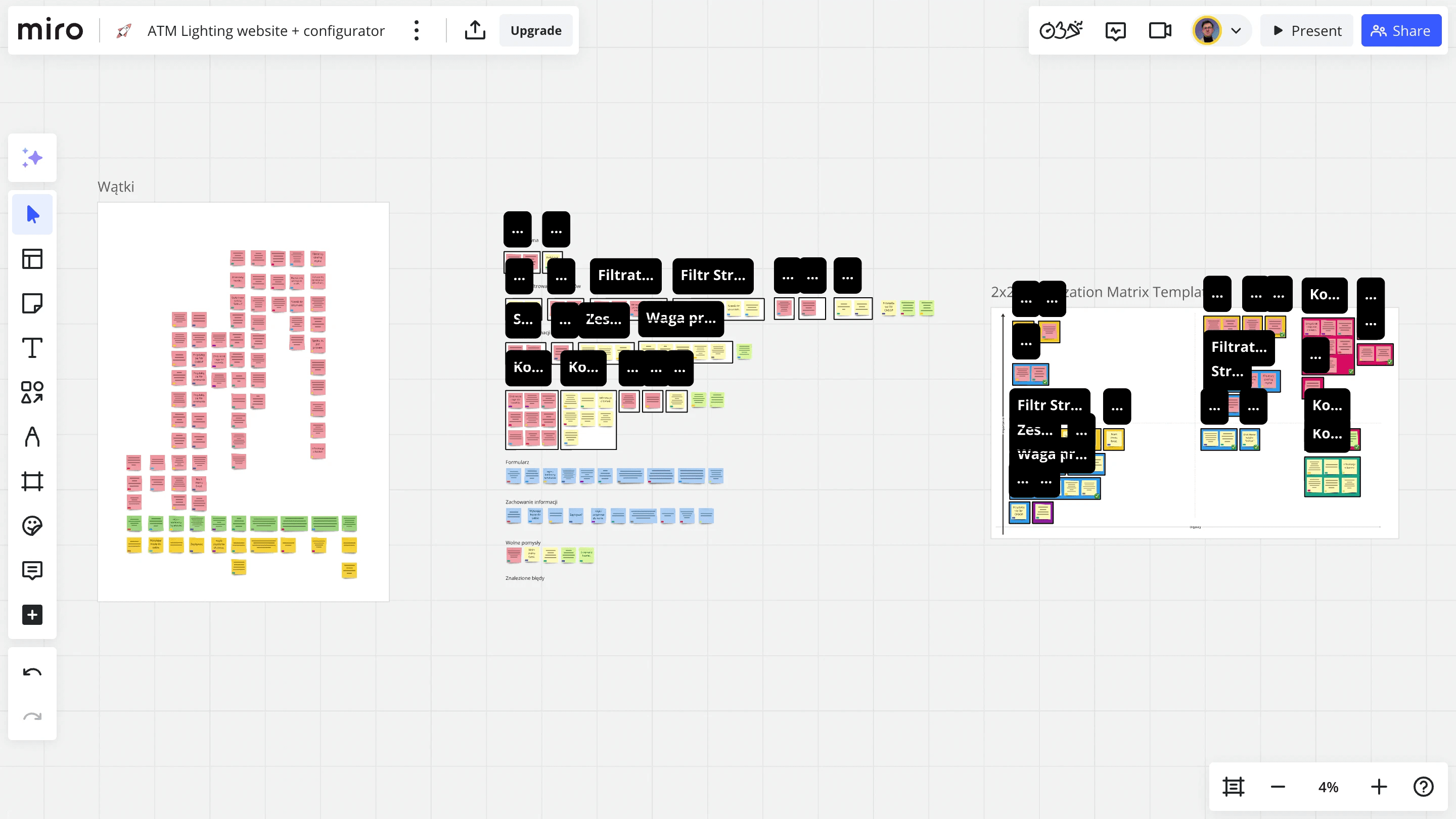
For the next step - user research, I prepared a research plan, make a screener and I was already done with first in-depth interviews. So far, I have been relying on the customer list provided by the sales department. I analyzed what companies these were and tried to create a proto-persona. Those were people who bought our products in the last two years. I focused on the explosion-proof related orders, as it's company's advantage in the market. And then BAM!💥 I realized that I was very wrong!
In many electrical projects for industrial buildings, there are specific conditions required for the lighting. Sometimes, there are specific light fixtures included into the projects, and people that I already work with, they don't really have any choice on what they order. That's why I had to make a pivot and focus on Lighting Designers - those people have real impact on choosing light fittings. I conducted additional 6 interviews with Lighting Designers.
The most important insights from IDIs:
1
They focus on product specification
Ligting Designers work on light fixtures characteristics. The accessibility to the products specification is the key for them. The name work as a reference code only in case of any contact with the manufacturer.
2
They're overworked and busy
Specialists value their time. When they visit a website and can't find suitable product once, they don't even try again. We need to save their precious time to build our website retention.
3
They work smart, they use BIM
Building Information Modeling is a 3D building model completed with different kind of information. What's more, it allows to communicate between participants of the designing and constructing process.

❌ Product families are on separate pages.
❌ No product filtering options.
❌ Products can only be searched by opening pages individually.
❌ Product series tabs are not visible.
✅ General and sub-product listing pages accessible from the main menu.
✅ Multiple filters available for easy product selection.
✅ All tabs converted into filters for streamlined navigation.
✅ Clean grid layout with concise descriptions.
❌ No call to action button on product site,
❌ Difficult product available configuration scheme,
❌ Unknown manufacturer markings without explanation,
✅ Inquiry button that generates leads,
✅ Products configurator that not requires specialist knowledge,
✅ Gallery of products in different configurations,
The layout is simple and easy to use, with a clear product image for quick understanding. However, the process has too many steps, hidden options that depend on previous choices, and lacks standardization, making it confusing. To improve, simplify choices, reveal dependencies clearly, and ensure consistent design throughout.
Another issue was that users had to make their selections twice: first during product search and filtering, and then again on the configurator page. To address this, I combined these two user flows into one seamless process. This starts from the main page and ends with sending an inquiry and placing an order. I proposed adding individual configurators to each product page, allowing users to make choices specific to that product directly.
I aimed to evaluate the entire system (website and configurator) as a cohesive unit. Once the MVP of the configurator was ready for testing, I incorporated two different products and conducted extensive usability testing with 10 real users, spanning a range of ages (18 to 56 years) and skill levels.


The process began with a brief interview to understand users’ familiarity with lighting concepts, ATM Lighting products, and their motivation for visiting the website. This was followed by task-based usability tests, where users completed two tasks to evaluate the usability of the website and product configurator, focusing on navigation, information retrieval, and product configuration. Observations and challenges encountered were explored further during an in-depth interview (IDI), which aimed to identify additional issues and gather overall impressions of the system. Finally, a survey was conducted using the System Usability Scale (SUS) to measure usability and the Net Promoter Score (NPS) to gauge user satisfaction.
✅ Skipping step is disabled. Editing available after summary,
✅ Every step has set a standard value at the beginning,
✅ Additional notes under the configurator,
❌ Value on active bar (orange) shows up after progressing to next step.
✅ Value changes immediately after making a choice.
After half a year of busy yet fun time, thats what we accomplished: